How to Build a Dashboard With an Agent
A practical guide to building trusted dashboards from metric definitions, source data, chart choices, and approval gates.

Founder, Task Machine
Building a dashboard with an agent means giving a data analyst agent the audience, metric definitions, source data, and decision context, then having it design charts and assemble a dashboard for review. The useful output is a dashboard whose numbers and visual choices can be checked.
The work matters because dashboard mistakes are expensive in quiet ways. A shifting denominator, a partial month beside full months, a bar chart with a broken baseline, or an undefined "active user" can lead a team to act on a false trend.
Why dashboards lose trust
Dashboards often begin with the chart instead of the question. Someone asks for "a growth dashboard", the builder picks a few familiar metrics, and the result looks complete while hiding the definitions that make the numbers meaningful.
The bundle's method starts earlier. It asks who the dashboard is for, what decision the reader makes from it, what each metric means, which source provides the data, and which chart type answers each question honestly. Then it self-critiques the dashboard for accuracy, design, and accessibility before approval.
What the manual process looks like
Done by hand, a trustworthy dashboard build has a clear sequence:
- Define the audience and the decision the dashboard supports.
- Write metric definitions: formula, grain, standard filters, comparison period, source, and caveats.
- Gather the data from an analytics query, warehouse query, pasted table, CSV, or sample dataset.
- Choose the right chart for each question, not the chart that is easiest to build.
- Assemble KPI cards, charts, filters, and any detail table into one coherent view.
- Check the numbers, axes, labels, colors, periods, and source notes before publishing.
The skipped step is usually metric definition. That is where most disagreement hides until the dashboard has already shaped a decision.
What an agent can automate
An agent can handle much of the construction work while keeping the reviewer in control:
- Scope the dashboard. The agent asks for audience, purpose, key metrics, data sources, and refresh cadence before choosing visuals.
- Define metrics. It updates the metric definitions document so the dashboard has formulas, filters, grain, comparison periods, and caveats.
- Pick chart types deliberately. Time series become lines, category comparisons become bars, composition gets a limited part-to-whole view, and dense detail moves to tables or small multiples.
- Assemble the artifact. The agent creates a self-contained dashboard with KPI cards, charts, filters, and a visible source and "as of" date.
- Self-critique before approval. It checks baselines, scales, labels, color reliance, titles, and spot-checks against a known source.
The agent drafts the dashboard. The human still approves whether it should be published and whether the numbers match the business definition.
The guardrails that make it safe
Dashboard automation needs guardrails because a polished visualization can make bad data look authoritative. The first guardrail is the metric definitions document. If a metric is undefined, the agent must define it or flag it instead of improvising.
The second guardrail is the self-critique step. The agent reviews chart accuracy and accessibility before the human sees the artifact: bars start at zero, comparison scales match, titles state the insight, the view works without color, and key numbers are spot-checked. Publication waits for human approval.
Set it up in Task Machine
The Dashboard design & data visualization playbook provides a starting point for the method above. You need an active Task Machine workspace with Chat, workspace-management and Playbook-installation access (workspace owners have it). Analytics access is useful, but the workflow can build from attached exports, pasted tables, or the metric definitions document.
1. Find the playbook
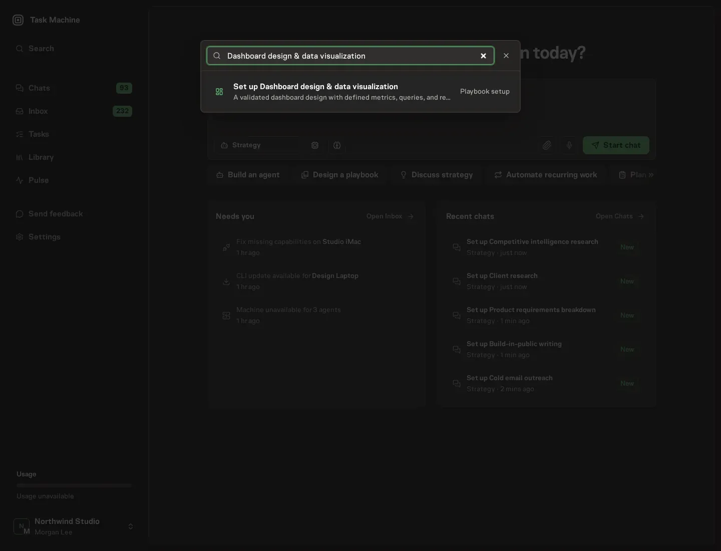
Open Search in your workspace and enter "Dashboard design & data visualization". The command center lists Set up Dashboard design & data visualization under Playbook setup.
2. Start the conversation
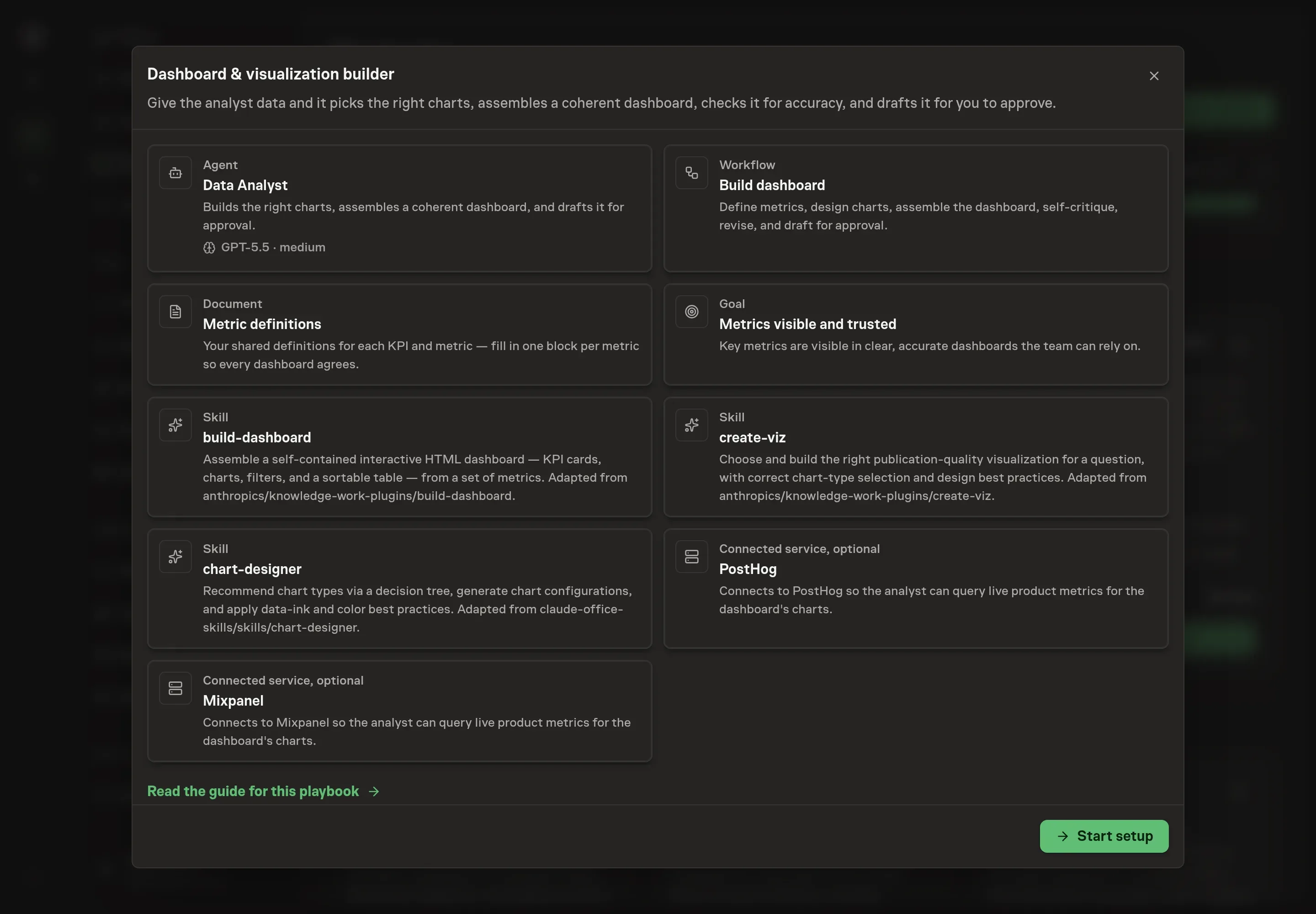
Choose Set up Dashboard design & data visualization. Task Machine opens a dedicated Chat with the Playbook card and an editable, unsent request. Read the intended job and outcome. Add your situation and send it when ready. Opening the draft does not install anything or start work. This walkthrough uses settings that require approval of the proposed Playbook.
3. Agree the services
Tell the Agent which services you use. The catalog offers these starting choices:
- Product analytics providers: PostHog, Mixpanel. Optional.
Discuss any missing access or export-based alternative before generation. Check the exact proposal includes only the services you agreed. Enter credentials only through secure setup, never in Chat.
4. Agree the working brief
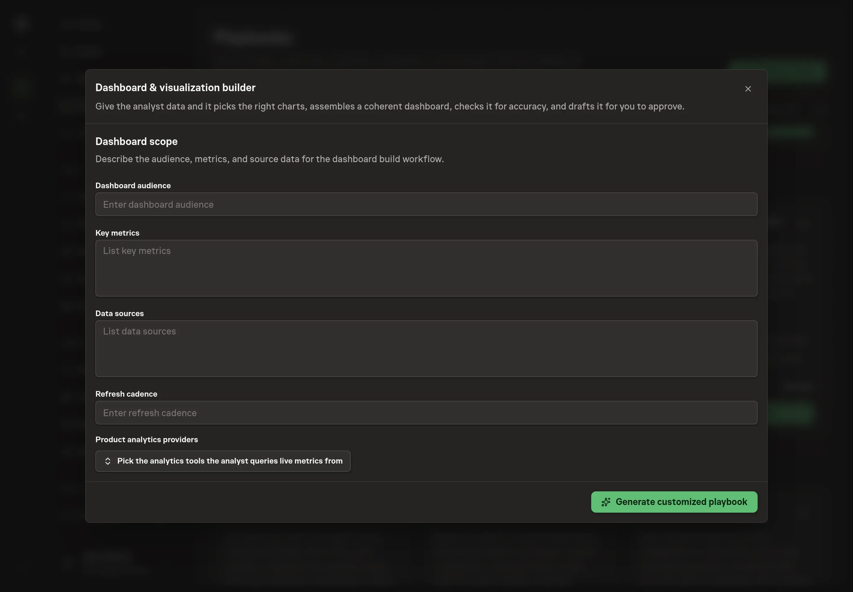
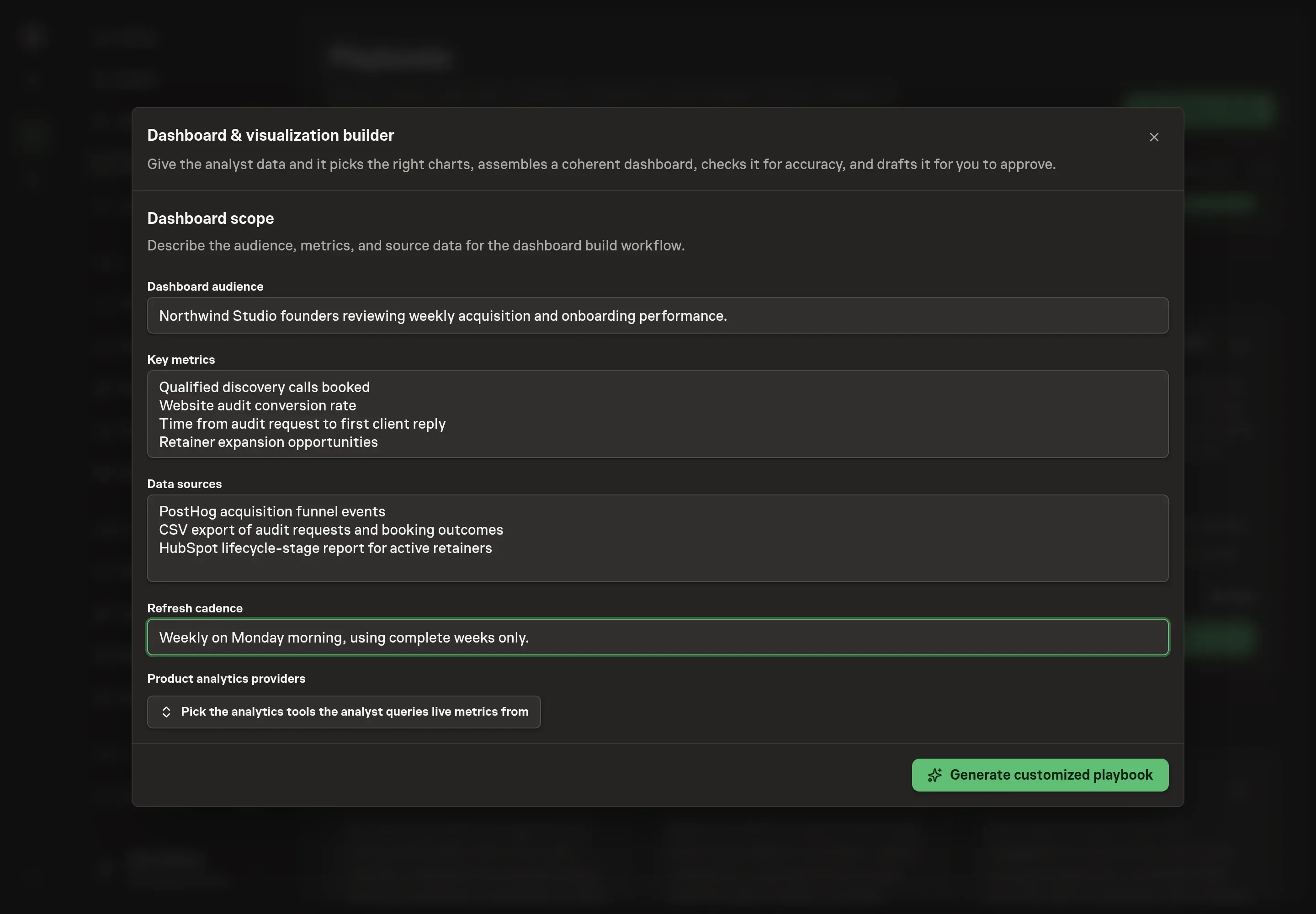
Use Chat to agree the inputs, expected output and limits before asking for a proposal. Discuss the dashboard audience, key metrics, data sources, refresh cadence, and analytics provider choice. Strong answers name the reader and the decision, not only the chart list. For example, say whether founders are deciding where to focus sales, onboarding, or retention work.
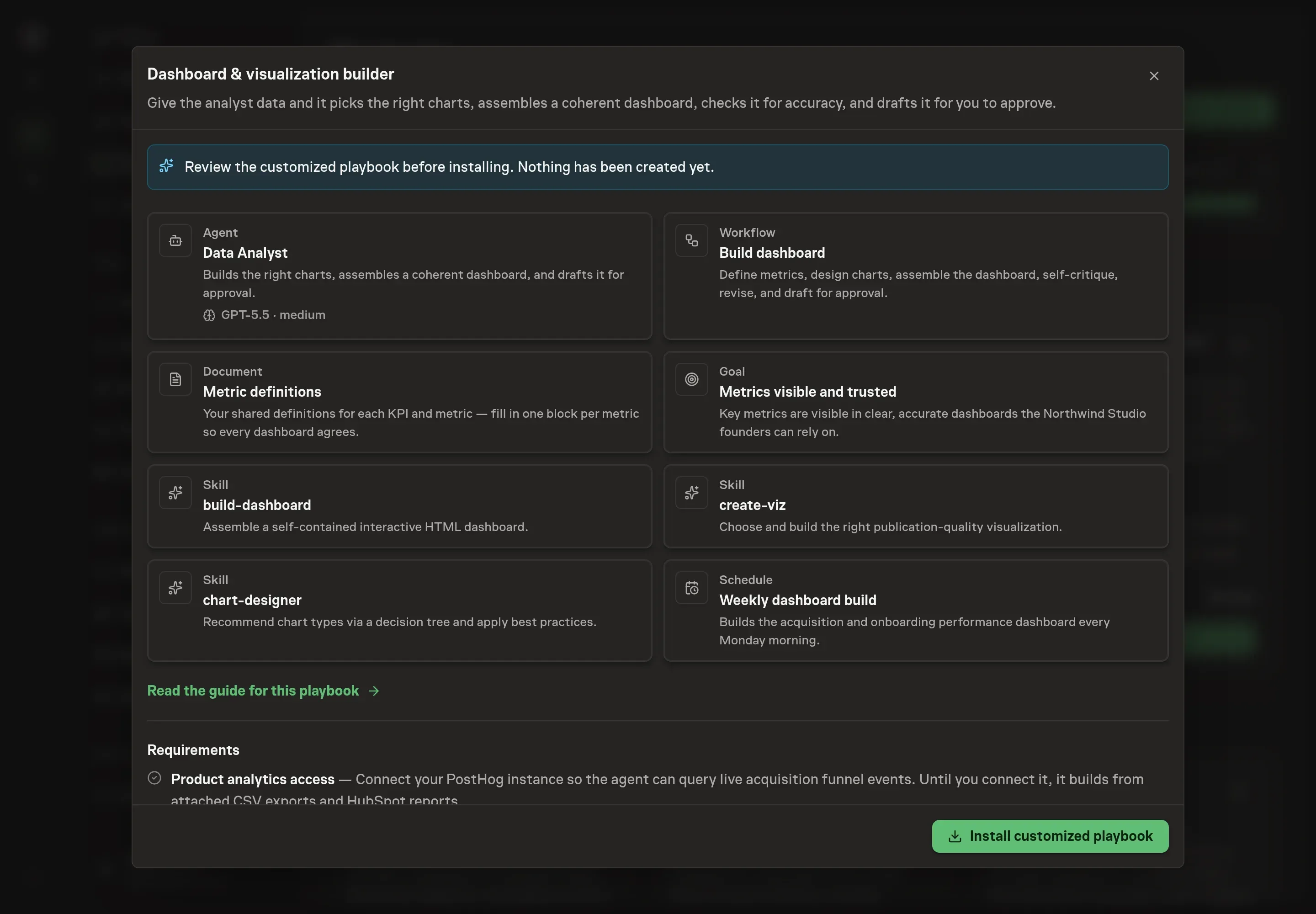
5. Review the proposed Playbook
Ask the Agent to generate the Playbook from the agreed brief. Open its proposal in Chat and check the instructions and resources it will install, which carry more detail than the conversational summary. Check that the workflow defines metrics, designs charts, assembles the dashboard, self-critiques, and waits for approval. Ask for a revised proposal if anything is missing or changes the job.
6. Approve and prepare the first work
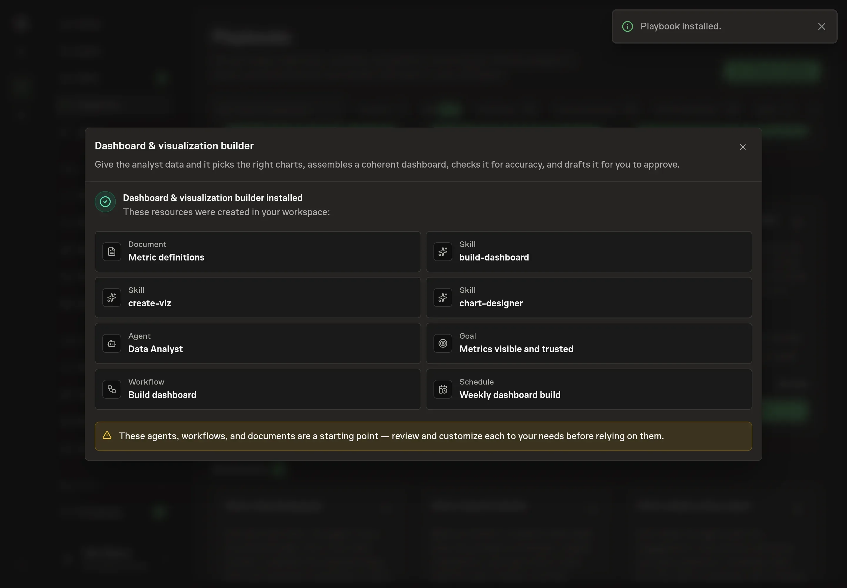
Choose Approve on the proposal in Chat when the configuration matches your brief. Task Machine installs that reviewed configuration. The approved item retains its review details. If your autonomy settings allow direct installation, this approval may not be required. Check the resulting configuration in that case too.
Complete any remaining secure service setup from the installation details in Chat. Inbox keeps those setup items available if you return later. Prepare the source documents and inputs before starting the first Task or Workflow. Installation does not authorize sending, publishing or changing an external service beyond the boundaries you agreed.
What good looks like
The dashboard is ready when a reviewer can trust it quickly:
- Every metric is defined. Formula, grain, filters, comparison period, and source are visible in the metric definitions document.
- Each chart answers one question. The chart type matches the relationship being shown.
- The source is visible. The dashboard states where the data came from and the "as of" date.
- The critique found no accuracy issues. Baselines, scales, labels, periods, and accessibility checks pass before approval.
Common questions
Can the agent build from a CSV instead of live analytics? Yes. The playbook supports attached exports, pasted tables, and live analytics where authorized.
What if the metric definition is missing? The agent should define it in the metric definitions document or flag the gap before building the chart.
Can it publish the dashboard automatically? No. It drafts and critiques the dashboard, then waits for human approval before publication.
When is a dashboard the wrong tool? When the dataset is too large for a self-contained artifact, or when the question needs live operational alerting rather than a reviewable dashboard.