How to Generate a Brand and Theme Kit
A practical guide to generating a brand and theme kit with an agent: voice, palette, type pairing, code-ready tokens, and approval before anything ships.

Founder, Task Machine
A brand and theme kit is the written system behind how a product looks and sounds: a voice, a color palette with exact hex values and a role for each color, a heading and body type pairing with fallbacks, spacing and radius scales, and a set of named tokens that carry every one of those decisions straight into code. It turns brand from a feeling into a specification someone else can build from.
Most small teams skip writing one because the product ships either way. The cost shows up later: every page, deck, and screen makes its own small design decisions, the decisions drift apart, and rebuilding coherence costs far more than writing the system down once would have.
Without a brand system, every page improvises
Without a shared system, brand decisions get made at the moment of need. A landing page picks a blue, a pitch deck picks a slightly different one, and a product screen inherits whatever the component library shipped with. None of those choices is wrong on its own. Together they read as a company that has not decided what it looks like.
The cost lands on developers too. When values live only in mockups, every build starts with guesswork: which gray is the border, what size a caption is, how round a card should be. Each guess is small, and the guesses compound into a codebase where the same decision exists in five slightly different forms.
There is also the sameness problem. Design produced without deliberate choices clusters around a handful of templated looks, so a brand that never states its own system tends to end up resembling every other brand that never stated theirs.
What the manual process looks like
Done by hand, building a brand and theme kit is a sequence most designers will recognize:
- Gather the inputs: what the product is, who it is for, the single job the brand has to do, reference material, and the elements that must survive (an existing mark, a name, a color).
- Define the voice as a few adjectives, then say what each one means in practice, because "plain-spoken" only helps once it translates to sentence case, active verbs, and no filler.
- Choose a palette of four to six colors with a role and a hex code for each: neutrals for text and backgrounds, a small set of accents for everything else.
- Pick a type pairing: a characterful display face used with restraint, a complementary body face, system fallbacks so the look survives where the brand fonts are not installed, and a scale with intentional sizes and weights.
- Set a base spacing unit, then build the spacing and radius scales on it.
- Pick the one signature element the brand is remembered by, and keep everything else quiet around it.
- Name every value as a token, check that body text clears contrast against every background it lands on, and write the whole thing up so someone else can apply it without asking.
None of these steps is hard for an experienced designer. The problem is that the sequence is long, the checks at the end are tedious, and skipping the write-up is always tempting, which is how kits end up half-finished and values end up living only in screenshots.
What an agent can automate
Most of that sequence is method rather than taste, which makes it a good fit for a pair of agents running a fixed workflow:
- Ground the kit in the subject. The agent reads your brand inputs, and when browser access to a site or design tool is connected, it reads the live colors, type, and spacing directly. If the inputs do not pin down the product, the audience, and the brand's single job, it pins them and states the choice instead of designing in a vacuum.
- Draft the system in order. Voice first, as three adjectives with what each means in practice. Then a cohesive palette of four to six colors with roles and hex codes, a deliberate display and body type pairing with system fallbacks and a scale, spacing and radius scales, and one signature element with everything else kept quiet around it.
- Tokenize every value. Each color, size, space, and radius becomes a named token, such as
color.primary,space.4, andradius.md, so the kit maps straight to code with no orphan values living only in a screenshot. - Critique before you ever see it. A second agent checks the draft for coherence (do voice, color, type, and spacing reinforce each other), accessibility (body text clears WCAG AA, accents stay legible, focus stays visible, motion stays restrained), templated defaults, and token completeness, then returns a precise list of corrections for the designer to work in.
What stays with you is taste: whether the palette feels like your brand, whether the signature is the right risk, and whether the kit ships at all.
The guardrails that make it safe
A brand kit touches everything a customer sees, which is exactly why the last step should not be automated.
The safe shape is a workflow that ends at an explicit approval step: the designer drafts, the critic corrects, the designer revises, and the finished kit waits for you. You review the guidelines and tokens, refine the palette, voice, or signature, and approve. The critic never approves on your behalf, and the designer never changes live brand assets or a site itself. When browser access to a site or design tool is connected, the agent works through its web interface and pauses for your approval before making changes. Until then it only reads what you attach.
Set it up in Task Machine
The Brand identity & theme design playbook provides a starting point for the method above. You need an active Task Machine workspace with Chat, workspace-management and Playbook-installation access (workspace owners have it). Browser access to your site or design tool is not required up front. Until you connect it, the agents work from the brand inputs, screenshots, and exports you attach.
1. Find the playbook
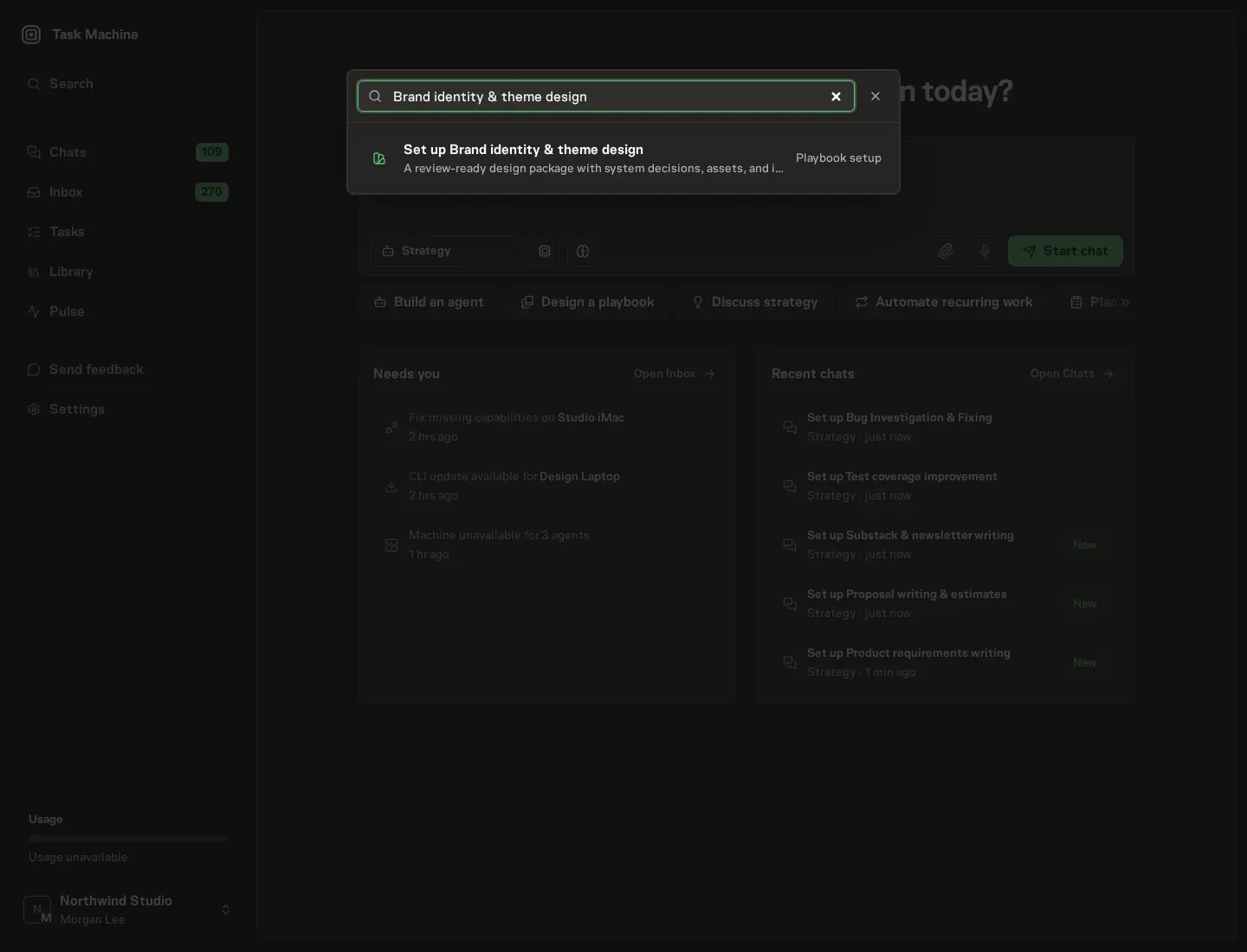
Open Search in your workspace and enter "Brand identity & theme design". The command center lists Set up Brand identity & theme design under Playbook setup.
2. Start the conversation
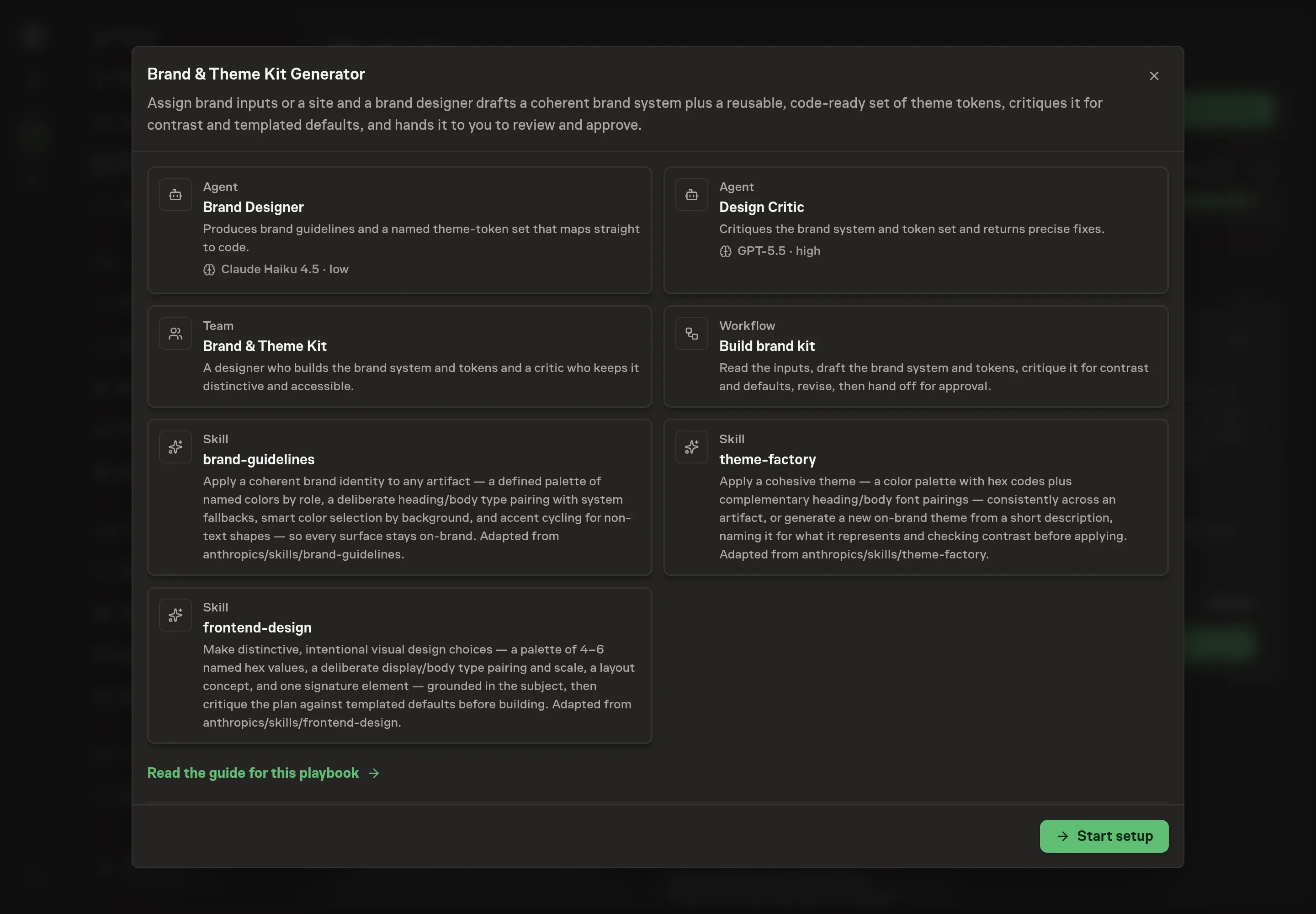
Choose Set up Brand identity & theme design. Task Machine opens a dedicated Chat with the Playbook card and an editable, unsent request. Read the intended job and outcome. Add your situation and send it when ready. Opening the draft does not install anything or start work. This walkthrough uses settings that require approval of the proposed Playbook.
3. Agree the working brief
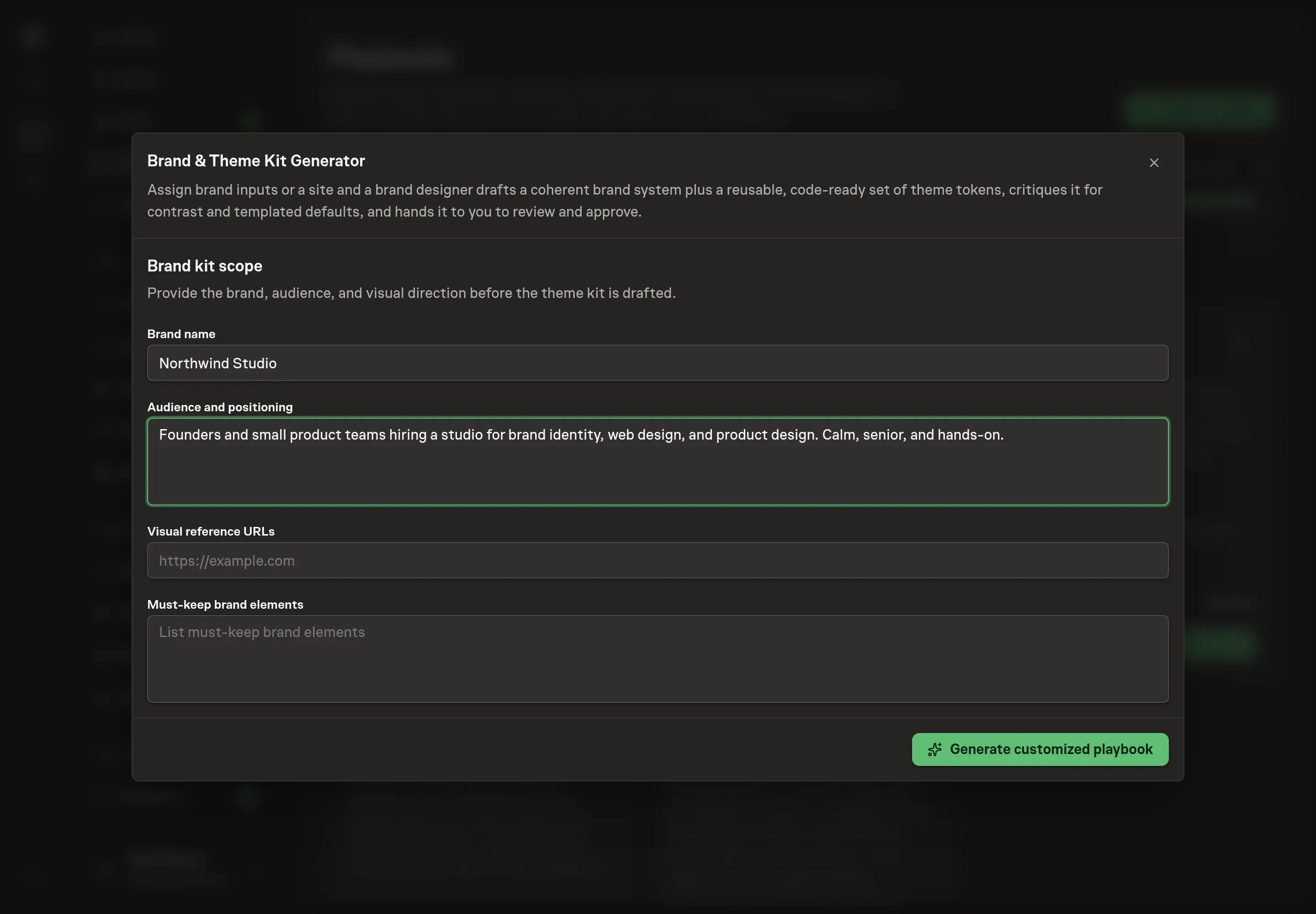
Use Chat to agree the inputs, expected output and limits before asking for a proposal. The Agent needs the scope of the kit. Four answers shape every draft: Brand name, Audience and positioning (who the brand speaks to and how it is positioned, which grounds the voice and palette), Visual reference URLs (the sites or pages whose direction the kit should learn from), and Must-keep brand elements (the marks, names, or colors the kit builds around rather than replaces).
4. Review the proposed Playbook
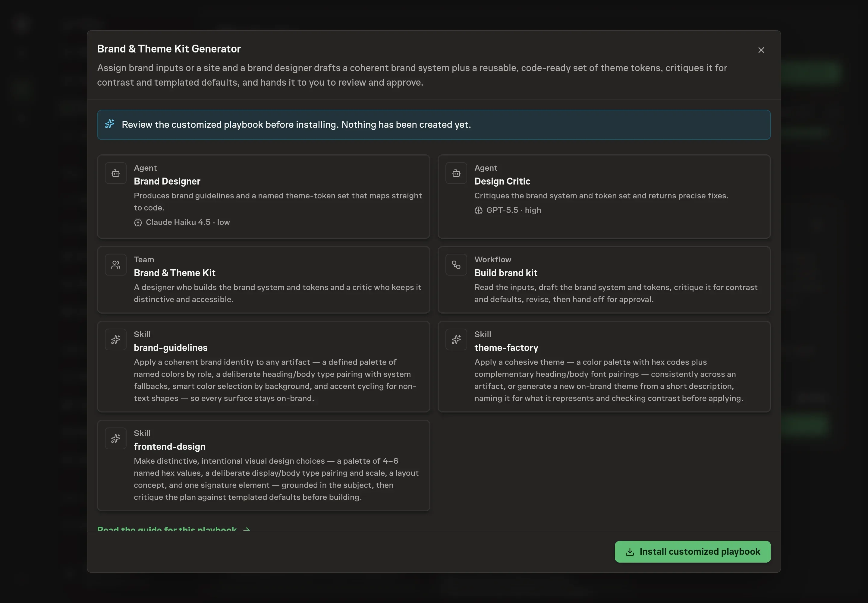
Ask the Agent to generate the Playbook from the agreed brief. Open its proposal in Chat and check the instructions and resources it will install, which carry more detail than the conversational summary. Read through the agent cards, confirm the audience and must-keep elements landed in the instructions, and check the workflow's steps from intake to approval. Ask for a revised proposal if anything is missing or changes the job.
5. Approve and prepare the first work
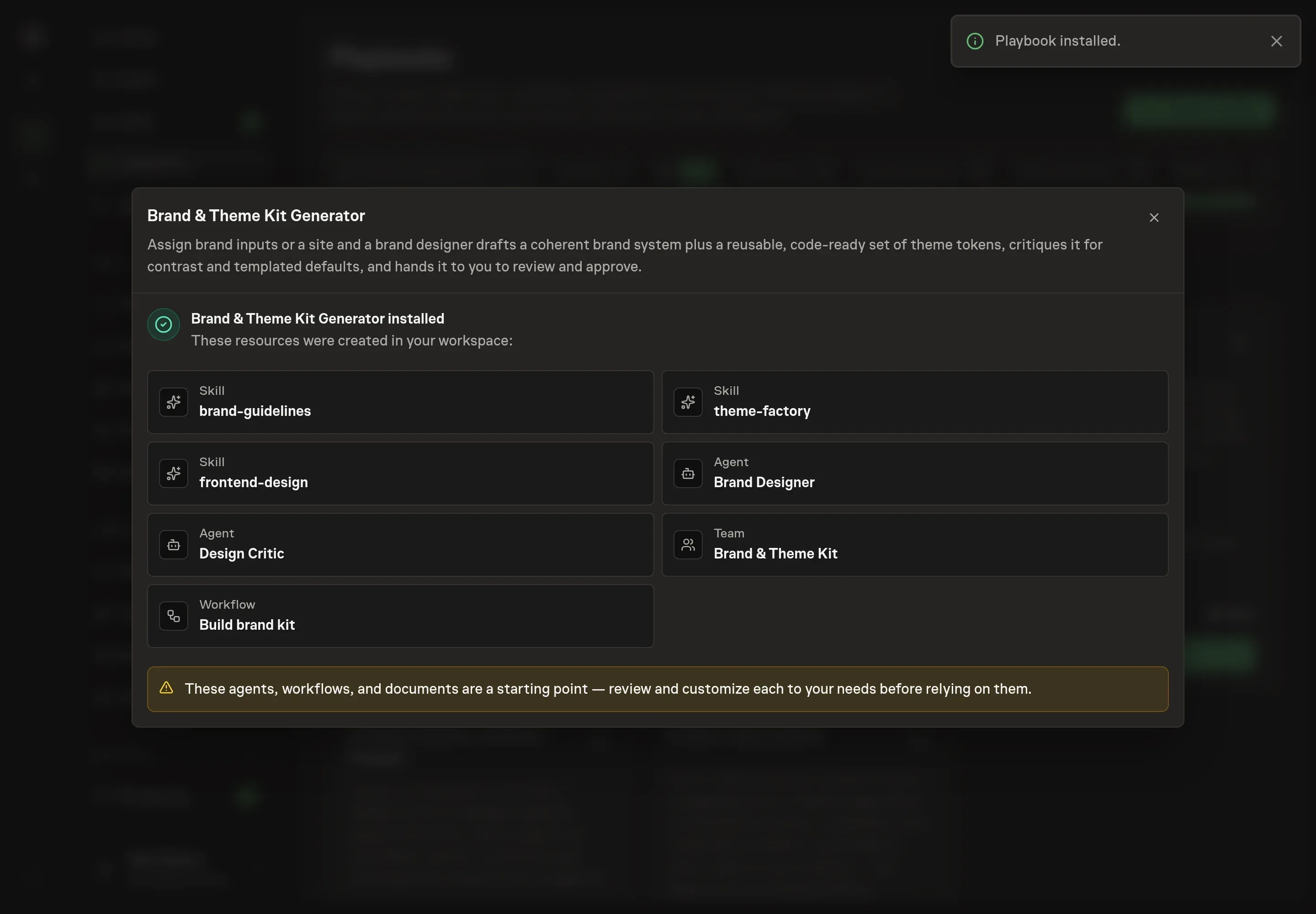
Choose Approve on the proposal in Chat when the configuration matches your brief. Task Machine installs that reviewed configuration. The approved item retains its review details. If your autonomy settings allow direct installation, this approval may not be required. Check the resulting configuration in that case too.
Complete any remaining secure service setup from the installation details in Chat. Inbox keeps those setup items available if you return later. Prepare the source documents and inputs before starting the first Task or Workflow. Installation does not authorize sending, publishing or changing an external service beyond the boundaries you agreed.
What good looks like
Three checks tell you whether a kit is finished:
- Every value is a named token. A developer can build from the kit without opening a screenshot. Any color, size, space, or radius that exists only in a mockup is an orphan, and an orphan means the kit is not done.
- Body text clears WCAG AA against every background it lands on, including the non-default ones. Accents stay legible, focus stays visible, and motion stays restrained.
- Four to six colors, one signature. A palette that needs more colors usually has missing roles. A kit with more than one signature spent its boldness everywhere, which reads as nowhere.
Common questions
Do you need an existing site to start? No. The workflow runs from whatever you attach: a positioning paragraph, screenshots, exports, and reference URLs. Connecting browser access to a site or design tool lets the designer read the live colors, type, and spacing instead of reconstructing them, but nothing waits on it.
Will the agent change the live site or existing brand assets? No. The designer produces guidelines and tokens for you to apply. It never changes live brand assets or a site itself, and when browser access is connected it pauses for your approval before making changes.
What exactly is a theme token? A named value that records one real design decision, like color.primary, space.4, or radius.md. The name is the contract: a developer uses the token without guessing, and when the decision changes, it changes in one place. A complete kit has one token per decision and no values that live only in a picture.
What keeps the kit from looking like every other generated brand? The critique step checks for the three templated looks that generated design clusters around: cream with a high-contrast serif and terracotta, near-black with one acid accent, and hairline broadsheet rules with zero radius. Any axis that landed on one of those defaults without the brief asking for it gets flagged, together with the specific change that would make it deliberate.
Why two agents instead of one? Because drafting and judging are different jobs. The designer is built to make opinionated choices, and the critic is built to check them for coherence, contrast, defaults, and completeness with fresh eyes. The critic returns a precise list of corrections rather than rewriting the kit, so the voice stays consistent and every change stays traceable.